CRM data visualization turns complex customer info into easy-to-understand graphics. Here’s what you need to know:
- It speeds up decision-making and helps find insights
- AI, real-time updates, and mobile-friendly visuals are hot trends
- Top tools include Zoho Analytics, Tableau, and Power BI
Key techniques:
- Interactive dashboards
- Real-time updates
- Custom reports
- Advanced charts
- Geospatial mapping
Quick Comparison:
| Tool | Starting Price | Best For |
|---|---|---|
| Zoho Analytics | $24/month | Small to medium businesses |
| Tableau | $15/user/month | Advanced analysis |
| Power BI | $9.99/user/month | Microsoft integration |
CRM data visualization helps businesses understand customers better, make faster decisions, and boost team performance. By turning numbers into visuals, companies can spot opportunities and fix problems easier than ever.
What is CRM data visualization?
CRM data visualization turns customer info into easy-to-understand graphics. It helps businesses make sense of their data and use it to improve customer relationships.
Definition and main purpose
It’s about creating charts, graphs, and maps from customer data. The main goals?
- Spot customer behavior trends
- Track sales and marketing performance
- Make smart choices based on clear info
Picture a sales team using a bar chart to compare monthly sales or a map to see where most customers live.
How businesses benefit
Small and medium businesses can get a lot out of CRM data visualization:
1. Faster decision-making
Visual data? We process it WAY faster than text. Teams can understand and act quicker.
2. Better customer insights
Seeing patterns helps businesses understand customers better. Result? More personalized service and marketing.
3. Improved team performance
| Benefit | Example |
|---|---|
| Sales tracking | Real-time pipeline views spot bottlenecks |
| Customer service | Graphs show response times and satisfaction |
| Marketing | Charts display campaign effectiveness |
4. Time and cost savings
Dashboards beat spreadsheets. Teams grasp key info fast, saving hours and focusing efforts where they matter.
CRM data visualization isn’t just pretty pictures. It’s a tool for working smarter with customer data. By turning numbers into visuals, companies can spot opportunities, fix problems, and keep customers happy – easier than ever.
Top CRM data visualization tools for 2024
Let’s check out the best CRM data visualization tools for 2024:
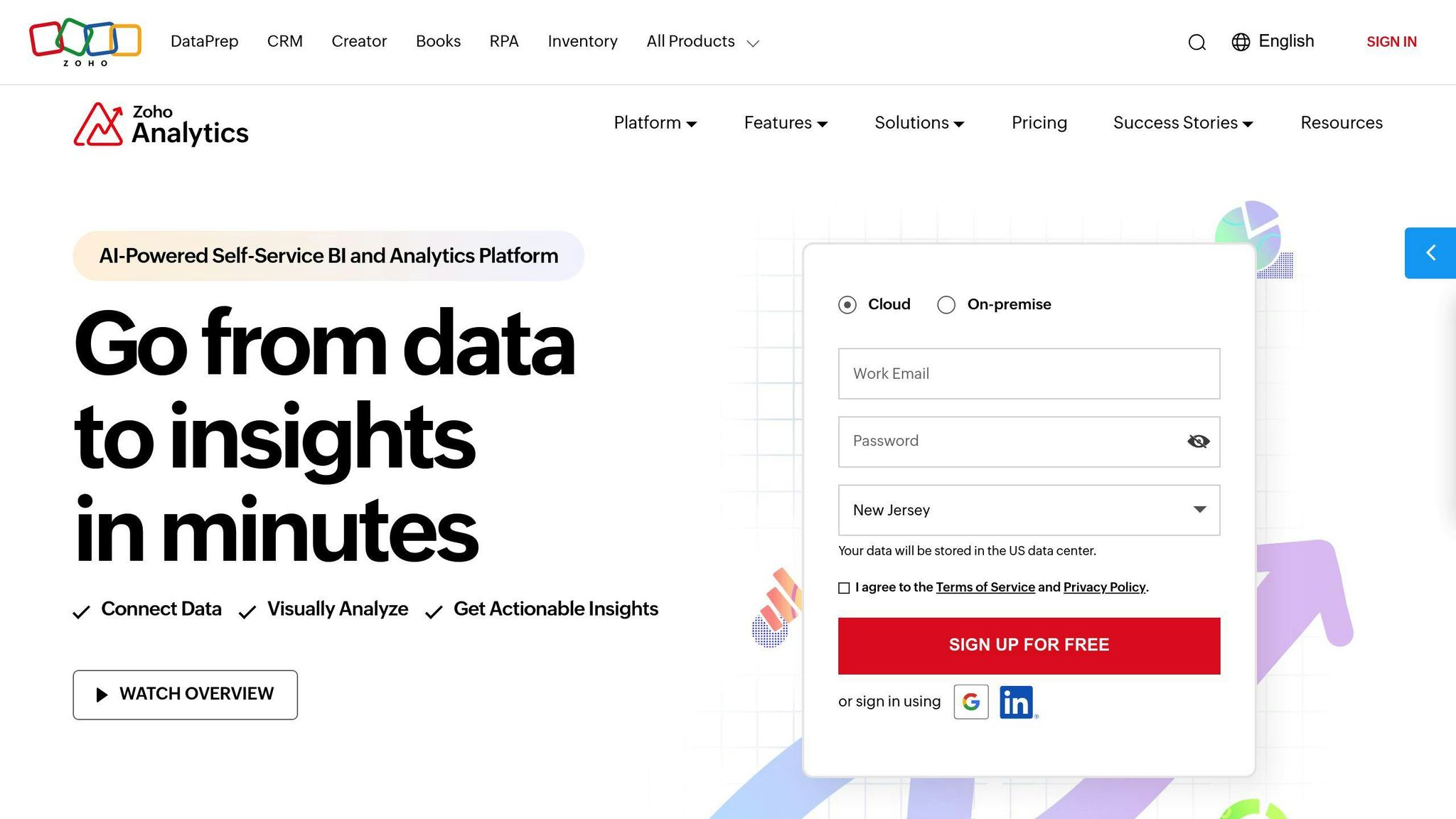
Zoho Analytics

Zoho Analytics is user-friendly and packed with features:
- 500+ data connectors
- AI assistant for natural language queries
- Custom charts and graphs
- Cloud or on-premise options
It’s budget-friendly at $24/month for two users. Perfect for small to medium businesses.
"We picked Zoho Analytics over Tableau for its better-tiered pricing." – Kapil Pendse, CTO & Product Manager, KAI Square
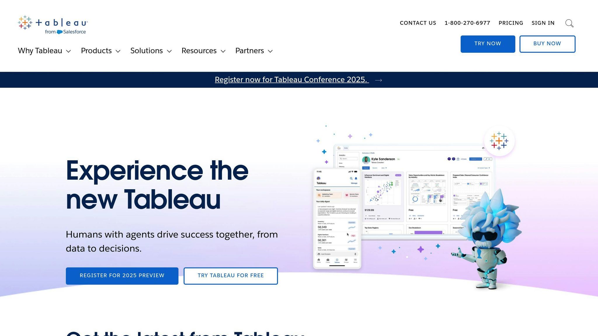
Tableau

Tableau is a powerhouse for data visualization and business intelligence:
- Advanced analysis tools
- Tons of chart types
- Handles complex data well
But it’s pricier at $15/month per user and has a steeper learning curve.
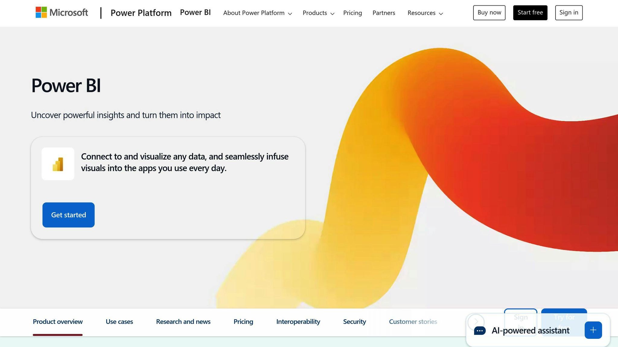
Power BI

Microsoft’s Power BI is easy to use and feature-rich:
- Intuitive design
- Works great with Microsoft products
- Drag-and-drop interface
- Lots of visualization options
Pricing starts at $9.99 per user/month for full collaboration.
Other solid options
| Tool | Starting Price | Key Features |
|---|---|---|
| Nutshell | $16/month | Custom reporting, sales insights |
| Copper | $23/month | Goal tracking, sales forecasting |
| NetHunt | Free | G Suite integration, customizable reports |
| Pipedrive | $12/month | Advanced forecasting, activity reports |
When picking a CRM visualization tool, think about:
1. Your budget
How much can you spend? Some tools are more affordable than others.
2. Must-have features
Do you need custom reports? Real-time updates? Make a list of your non-negotiables.
3. Ease of use
How tech-savvy is your team? Some tools are more user-friendly than others.
4. Integration
Will it play nice with your current systems? This can save you a lot of headaches down the road.
Key CRM data visualization techniques
CRM data visualization turns complex customer data into easy-to-understand visuals. Here’s how businesses are doing it:
Interactive dashboards
These give you a live look at your CRM data. You can:
- Filter data on the spot
- Dig into the details
- Catch trends fast
McCrindle, an Australian research agency, uses custom dashboards to watch their entire sales cycle. They can slice and dice data by pipeline, product, or customer type.
Real-time updates
Real-time data keeps everyone in sync. It’s a game-changer for:
- Sales teams chasing quotas
- Customer service watching response times
- Execs making snap decisions
Your Therapy Source, which provides online resources for therapists, uses ActiveCampaign’s marketing dashboard. It shows them how emails impact earnings as it happens.
Custom reports
These let you zero in on what matters most. You can:
- Track your key numbers
- Line up reports with your goals
- Highlight what each team needs to see
Advanced charts
These aren’t your average bar graphs. We’re talking:
| Chart Type | What it’s good for |
|---|---|
| Heat maps | Showing where data’s hot or not |
| Bubble charts | Comparing three things at once |
| Radar charts | Displaying multiple variables |
| Waterfall charts | Showing how data adds up over time |
These charts help you spot things you might miss in raw data.
Geospatial mapping
This puts your data on the map. Literally. It’s great for:
- Seeing sales territories
- Pinpointing customer locations
- Spotting regional trends
Imagine a sales team using this to see their best areas at a glance.
CRM data visualization best practices
To make your CRM data visualization pop, stick to these key practices:
Pick the right visualization
Match your visualization to your data:
| Data Type | Go-To Visualization |
|---|---|
| Comparisons | Bar charts |
| Time trends | Line charts |
| Parts of a whole | Pie charts (max 5 slices) |
| Geographic data | Maps |
Want to compare sales across regions? Bar chart. Tracking monthly revenue? Line chart.
Create clear visuals
Keep it simple:
- Stick to 5-6 colors max
- Label everything clearly
- Use descriptive titles
- Cut the clutter
Zoho CRM‘s instant charts? They’re a time-saver. Create visuals without picking a report first.
Ensure data quality
Your visuals are only as good as your data:
- Update KPIs regularly
- Clean out duplicates and errors
- Fill in data gaps
- Set up auto quality checks
Make user-friendly interfaces
Design with your users in mind:
- Group related metrics
- Use contrasting colors
- Let users filter and drill down
- Make it mobile-friendly
Zoho CRM’s group sharing? It’s great for team collaboration and real-time sales analysis.
Remember, it’s about insight, not just pretty pictures. As Ben Schneiderman said:
"The purpose of visualization is insight, not pictures."
sbb-itb-058cafb
New trends in CRM data visualization
AI in analytics
AI is shaking up CRM data handling. It’s not just fancy graphs anymore. AI can:
- Find hidden patterns
- Guess what’s coming next
- Make reports on its own
Take Salesforce’s Einstein GPT. It whips up AI content for sales, marketing, and customer service. This lets teams think big instead of typing all day.
Predictive visuals
CRM tools are getting good at showing the future. They use old data to paint tomorrow’s picture. This means:
- Sales teams see hot leads
- Support knows when it’ll get busy
- Marketers spot new customer groups
HubSpot’s ChatSpot drops these crystal ball insights right into CRM dashboards.
Mobile-first design
CRM data is breaking out of the office. Mobile access isn’t just nice – it’s a must. Here’s why:
| Feature | Benefit |
|---|---|
| Live updates | Decide on the move |
| Custom views | See what counts |
| Alerts | Track key numbers |
Zoho CRM’s app lets sales teams check stats on phones. Everyone stays in the loop, even on the go.
Connecting with other business tools
CRM visuals are becoming the heart of business data. By talking to other systems, they show the whole story. This means:
- Deeper customer chats
- Sharper forecasts
- Teams working as one
Microsoft Dynamics CRM links sales, marketing, and service data. It gives a full view of each customer.
CRM data viz is getting smarter, more mobile, and more connected. Businesses that jump on these trends will really get their customers.
CRM Data Visualization Success Stories
Let’s look at how some companies have used CRM data visualization to boost their game:
Sparex: One View for 18 Subsidiaries
Sparex, a global ag parts supplier, had a data mess. They used Zoho Analytics to clean it up. Now, they have ONE clear view of all 18 subsidiaries. Talk about a 360-degree view!
Ubq Technologies: Halving Work Time
Ubq Technologies hit the jackpot with Zoho Analytics. They cut their data work time by HALF. That’s 50% more time for growing the business instead of crunching numbers.
Renu Energy Solutions: Faster Installs, Happier Customers
Renu Energy Solutions had a problem: slow installs. Enter Zoho Analytics. John Sheldon, their BI Manager, says:
"Zoho Analytics has cut our deal-to-install time from 80 days to under 50."
That’s a 37.5% speed boost. Faster installs = happier customers.
Mitrefinch: Perfect Customer Satisfaction
Mitrefinch linked data viz to customer happiness. After using Zoho Analytics, their customer satisfaction scores jumped 20% to hit a perfect 100%. Now that’s something to visualize!
Key Takeaways
- Unite your data: Sparex showed a clear view is a powerful view.
- Boost efficiency: Ubq Technologies proved good tools can slash work time.
- Speed up service: Renu Energy Solutions linked faster data to faster customer service.
- Visualize satisfaction: Mitrefinch saw how better insights can make customers happier.
- Share the data love: The Collins Companies found giving sales agents their own data was a game-changer. Toni Wall, their Market Development Director, said:
"With Zoho Analytics, our sales agents see their performance, profit per order, and monthly targets. It’s a must for our sales team."
These stories show that CRM data visualization isn’t just eye candy. It’s a powerful tool for real business growth.
CRM data visualization problems and fixes
Common mistakes to avoid
Companies often mess up CRM data visualization. Here’s what to watch out for:
- No clear plan for who makes and uses visuals
- Team doesn’t get why data viz matters
- Garbage data = garbage insights
- Ignoring what your team actually needs
- Charts so complex they need a decoder ring
Dealing with complex data
Taming messy CRM data? It’s tough, but doable:
1. Clean it up
Use tools to zap duplicates, fill in blanks, and update old info.
2. Set data rules
Create clear guidelines for data entry. Consistency is key.
3. Pick the right tools
Your visualization software should handle your data load without breaking a sweat.
4. Focus on what matters
Don’t try to show EVERYTHING. Pick the metrics that really drive your business.
5. Keep it fresh
Set a schedule to review and update your data. Stale data = stale decisions.
Keeping data secure
Data security isn’t optional. Here’s how to lock down your CRM data:
- Encrypt EVERYTHING
- Use role-based access (not everyone needs to see it all)
- Set up multi-factor authentication
- Audit your system regularly
- Know and follow data rules (GDPR, CCPA, etc.)
- Back up your data
- Train your team on data safety
Remember: Your people are your first line of defense against data breaches.
Conclusion
Top tools and methods recap
CRM data visualization helps businesses make sense of customer data. Here’s a quick look at the best tools and techniques:
Top Tools:
- Zoho Analytics
- Tableau
- Power BI
- FiveCRM
- Teamgate
- Salesforce
- HubSpot
These tools offer features like customizable dashboards and real-time reporting. Tableau Desktop, for example, lets users spot trends quickly with interactive dashboards.
Key Techniques:
- Interactive dashboards
- Real-time data updates
- Custom reports
- Advanced charts
- Geospatial mapping
These techniques turn complex CRM data into clear insights. Sales teams can create dashboards showing lead generation efforts, helping clients understand campaign performance easily.
What’s next for CRM data visualization
The future of CRM data visualization looks promising. Here’s what to expect:
1. AI-powered insights
AI in CRM systems will improve data entry, email personalization, and sales forecasting. This means smarter visuals that help businesses anticipate customer needs.
2. Mobile-first design
CRM visualization tools are becoming more mobile-friendly. Teams can access and interpret data on the go, making better decisions faster.
3. IoT data integration
The Internet of Things will bring new data streams to CRMs. This real-time data will create more dynamic visualizations, offering deeper insights into customer behavior.
4. Industry-specific solutions
Expect more sector-specific tools that cater to unique industry needs, from healthcare to finance.
5. Enhanced data security
CRM visualization tools will focus more on security. Look for better encryption and compliance with regulations like GDPR and CCPA.
The future of CRM data visualization is about making data more accessible, secure, and useful. By keeping up with these trends, businesses can use their CRM data to boost growth and keep customers happy.
FAQs
What is the best tool to visualize database?
There’s no one-size-fits-all answer, but here are some top picks for 2024:
- Microsoft Power BI: Great for real-time analytics and big data
- Tableau: User-friendly with strong analytics
- Zoho Analytics: Integrates well with other Zoho tools
Here’s a quick comparison:
| Tool | Standout Feature | Ideal For |
|---|---|---|
| Power BI | Real-time data | Big companies |
| Tableau | Easy-to-use interface | Data pros |
| Zoho Analytics | AI assistant | Small to mid-sized businesses |
When picking a tool, think about:
- Your team’s tech skills
- How it fits with your current setup
- Room for growth
- Your budget

